Take pride in your eBook formatting
Posted by
Guido ·
Dec
7
To me, one of the key elements that sets apart a
professional eBook release from that of an amateur has always been the
technical presentation of the book. Sure, anyone can write a document in
a word processor, run it through some export tool, use a fully
automated conversion utility or peruse the services of an online
service, but the sad fact of the matter is that none of these approaches
typically results in, what I call, production-level digital books.
So, why are people using them? I have spent a lot of time thinking
about this and observing how other authors approach their eBook
publishing, and the more I examined it, the more I have noticed that
there are generally two reasons for it.
The first reason is that many authors simply don’t know any better.
They write their book, complete it and look for the fastest, cheapest
and easiest way to deploy it. Don’t be one of those authors! It is a sad
testimony in my opinion, and certainly not a valid excuse. You have
labored over your book for months, maybe even years, you have read and
re-read it countless times, cleaned out typos and grammatical errors,
massaged the style and worked on the structure, grinding away in the wee
hours of the night alongside holding a daytime job and maybe having a
family. You did not get here just to break the first cardinal rule of
book publishing:
Don’t get sloppy on the home stretch! It will reflect poorly on your work.
If you’re anything like me, an author you’re not familiar with has
one shot to prove himself to you. I will never again touch the book of
an author who has made a bad impression on me by delivering a broken
eBook that is clearly sub-par. I can forgive many things in a book if I
so please — stilted language, poor pacing, logical errors, uneven style,
even the occasional typo. However, one thing I cannot forgive is poor
eBook formatting, particularly if it is to the point that it becomes
distracting from the actual reading experience, and sadly I have seen
too many of these in recent memory.
I started reading books as a form of entertainment 35 years or so ago
and to this day I have not once found a printed book that had
formatting problems! Every book that goes to print is practically
flawless, except for a typo, perhaps, or print issues such as ink
blotting or somesuch production-line flaw. However, I have never seen a
book where the font size suddenly jumped, where the font face suddenly
changed, where indentations were all over the place or where paragraph
adjustment switched from justified to left aligned halfway through a
paragraph.
Since the dawn of eBooks, however, these things have become
prevalent, and what’s more worrisome is the fact that to many authors
this seems to be completely acceptable. To me that notion is ridiculous
and disconcerting, and no writer who is worth their salt should ever be
caught publishing an eBook that is not equally flawless as the
longstanding tradition of print books has dictated.
You may frown upon traditional publishing houses and their supposed
arrogance all you want, but most indie authors would still do well to
take a few lessons from these
dinosaurs. Among many other
things, at least they know how to produce and package a product for sale
and do not discount professionalism as a sales point at the expense of
instant self-gratification.
If you are a self-publishing writer and want to be taken seriously,
spend a little time getting acquainted what digital eBooks actually are.
Learn how they work, how they originated, what they can and cannot do.
You might be surprised how many cool features you can actually add to an
eBook with the proper background information and some of these
capabilities may truly enhance your books. Sure, some of the features
are not very useful for most types of books, but, just as an example,
did you know that you can actually embed video content in eBooks?
The second reason why many authors never take the time to create
proper, optimized eBooks is that they are perhaps intimidated by the
process. It is a technical process, to be sure, but it is nothing to shy
away from or to be afraid of. All it requires is a very basic sense of
structure and sequencing, things we’ve all been taught since first grade
and that we have down pat.
Let’s be realistic, for a moment. This is you, a smart and
intelligent person. You have written a book. You have mastered the
spelling of millions of words. You have internalized grammar rules and
overcome countless stylistic challenges over the course of putting your
book together, not to mention that, most likely, you had to plot it all
out properly to create a dramatic arc, or to create a stream of
conscious that readers can follow.
By comparison, creating professionally formatted eBooks is as easy as burning a marshmallow over an open fire.
Over the next couple of weeks I will post different installments on
this blog to show you how you, too, can get to state-of-the-art,
professional-looking eBooks that work perfectly on any eBook reader in
the market, taking the guess work out of creating your final product.
Why you shouldn’t use a word processor
When I visit message boards for authors on the the Internet I keep
coming across the same question over and over again, followed by what is
effectively the same advice over and again. Sadly, in my opinion, the
recommendations are all too often ill-advised and tend to create more
problems than they solve.
What I am referring to, of course, is the question that aspiring
independent authors frequently ask once they get to the stage where they
want to self-publish their books, “How do I create an eBook?” Aside
from the noise that such a question generates, the tenor of responses
usually goes something like “You can export an ePub file from your word
processor” or “Take your word processor file and upload it to
insert-your-favorite-conversion-service-here for conversion.”
To me, these responses are usually not real advice. They are
opinions. Someone suggests the procedure because it worked for them,
completely ignoring the fact that their own eBooks resulting from said
procedure are oftentimes riddled with problems and/or that the way to
get there was resembling running a gauntlet of cumbersome obstacles and
tests of patience.
Advice, on the other hand gives you the opportunity to make an
educated decision based on the evaluation of information. So, let me
give you a piece of advice.
Do not use a word processor file as the source of an eBook.
As you will see in a moment, word processors are not very good at
what eBooks do and are therefore the wrong tool for the job. It’s like
trying to hand someone a spoon to dig out a swimming pool. It is
certainly possible, but at what price?
In life, the proper tools will always make your life easier, because
tools are designed for a specific task. They will perform this
particular task better than any other tool and should therefore always
be your first choice. You would never use a blender to mix waffle
batter, yet that is exactly what many authors are doing when they try to
create eBooks straight out of a word processor document.
I can already hear you, getting all giddy with the question why I
suppose a word processor is the wrong tool, and I think it is time for
me to finally answer that question.
Word processors have been designed to enable writers. They are the
replacement of the typewriter — in case you still remember those. Their
goal is to make it possible for people to write text as cleanly and
efficiently as possible, allowing them to simply dump their thoughts
onto a computerized sheet of paper. In order to make this as easy as
possible, word processing software puts a number of additional tools at
the writer’s disposal which come in very handy and will help to keep
writers focused on the task.
That is the job of word processing software. However, as computers
became more powerful and software companies realized that they can’t
keep selling the same toolset to people over and over again they began
to add features. Slowly at first, further making the writing flow more
practical, it soon deteriorated into what developers know as “feature
creep.” It is a phenomenon that has cropped up across all branches of
software development and describes the situation when more and more
features are being added to software for nothing but their own sake. If
you take a look at today’s word processing packages you quickly realize
that they contain an overkill of flashy features designed solely to
impress users. At the same time, these packages contain a smorgasbord of
obscure features — many of which are actually helpful to writers but
not very sexy to market — that are so forgotten that most users don’t
even know they exist. Or did you know that your word processor probably
contains a generator to create random text? Better yet, did you know
that it probably contains a feature that allows you to create “Lorem
Ipsum?”
Which brings us to the next problem with word processors. Year after
year they have encroached upon the Desktop Publishing Space. It started
with simple WYSIWYG attempts and today virtually all word processors in
the market pretend to be able to do full page layout. I say “pretend”
because despite thinking of themselves as being the jack of all trades,
the DTP features in word processors are usually completely worthless.
Problems ranging from ridiculous sixteen linked-up textbox limits to
unpredictable text flow behavior and errors, make them pretenders in the
truest sense of the word, rather than contenders.
I am rambling, I know. So why am I telling you all this? To put it
simply, because these days word processors try to do too much and
obscure too much as a result. From the point of view of a book editor,
that is. All these fancy WYSIWYG text layout features are useless if
they can’t be properly converted into eBooks and that, in fact, is the
crux of the matter. Word processors are almost by definition inept in
handling text output that needs to be formatted for variable text flow —
a feature crucial to a good eBook.
To illustrate the point, let me show you the following word processor screenshot.
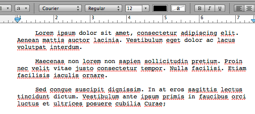
As you can see we have three paragraphs of text here, each formatted
with a first-line indentation and extra line spacing between each
paragraph. Simple enough, right? It’s what a manuscript should look like
in the computer.
The problem here is in the detail, however. What you don’t see is
what will run you to the edge of madness when the time comes to create
an eBook.
The first line created the indentation using a tabulation character,
the one generated when you hit the TAB key, while the second paragraph
achieved its indentation by inserting a series of white spaces, blanks.
The third paragraph on the other hand achieved the same goal by using a
style formatting, telling the word processor to automatically indent the
first line in every paragraph by a certain amount without requiring any
characters.
Three very different approaches to achieving the same thing. Make a
mental note, if you will, which one you think is the best way to achieve
first-line indentation. We will talk about it in a bit more detail
later on in the series.
This is but a small exploration of the problems inherent in that
little screenshot. If you look at the extra line spacing, you are
looking at another ugly beast rearing its head when the time comes to
create an eBook. The first paragraph has been set apart from the second
using an extra line feed character — inserted by pressing the Enter or
Return key on your keyboard. To set apart the second from the third
paragraph, however, we have once again applied style formatting instead,
which tells the software to automatically insert extra line spacing of a
certain size after every paragraph.
Are you seeing what I am driving at, yet? Since each of these
paragraphs has been created differently, there is a very real risk that
each of them will look differently once you let the word processor
export your text to an eBook. Naturally, the problem can be avoided by
using the same way throughout your entire document, but let’s face it,
in the real world, very few people are as rigorous and organized that
they apply the proper style setting every time they italicize text or
want to create an indentation, particularly over the period of time it
usually takes to write an entire book. Since we can’t easily see
existing formatting errors in the word processor, we are always
teetering on the edge of hidden defects using this methodology.
I could bore you with countless other examples where things can go
horribly wrong, but since you are reading this, I assume you already
figured that out yourself and are looking for a better way to do things.
As authors in the real world, what we need is a way to create eBooks
that produce reliable results, and word processors simply don’t do that.
What is needed, is a different approach, and I will tell you more about
that in the next installment of the series.
The Road to Right
After having spent a lot of time in my last installment, telling you
how you should not create an eBook, I will no longer hold you back with
explanations of Wrong and instead we will point our heads forward and
look down the road of
Right. Let’s start with a quick overview
over the process I am proposing just so you get a general idea for what
you’re going to get yourself into. Depending on your level of expertise
this might or might not be all that intimidating at first, but let me
assure you that there is no magic involved and every tasked can be
performed by virtually anyone familiar with a computer. Remember, the
key lies, as so often, in getting the right tools or the job and putting
them to work for you.
The majority of ebook formats in use today are nothing more than a
packaged collection of HTML files. Yes, the same kind of files used to
create and display web pages. Surprised? You shouldn’t be. It actually
makes a lot of sense. HTML has been created to allow information display
on a wide variety of display devices regardless of their capabilities.
Whether your computer monitor has a high or a low resolution, whether
you are running your browser fullscreen or in a small window, on an old
or a new computer, basic HTML pages will always be able to display
properly in all these environments.
Since we don’t know what device or software the reader will use when
they want to display our eBooks, it only makes sense to utilize a format
that is tweaked for that very purpose, doesn’t it? A format that has
free text reflow capabilities and can easily embed images and other
media. You might recall how I told you that you can actually embed video
in your eBooks if you want to, and now you know, why.
HTML is a format perfectly suitable for the needs of the eBook
community and all it really lacks is digital rights management, or copy
protection to put it in plain old English. To accommodate that, some of
the eBook formats are encrypted internally, but that is really none of
our concern at this point. Let other people worry about that. We just
want to package our book in a digital format that can be used by
eReaders for the time being.
Among recording musicians we have a saying that is very suitable for
our cause: Garbage in, garbage out! It means that when the source you
are recording is garbage, your end result will inevitably be garbage
also. There is just no way to make a bad source signal good. The
synthesized vocals of current-generation pop stars are living proof of
that.
Since we know that our end result is going to be an HTML file, the
best way to avoid garbage along the way is to choose a source format
that is as close to the output format as possible. So, if the output is
HTML, why not make the source format HTML also? HTML is a very simple
markup language that is so basic and, more importantly, widely document
today that anyone can pick up the basics in under 30 minutes. In fact,
many of you may already be familiar with the general basics of mark-up
languages from styling their message board posts or maybe even creating
their own web pages and blog posts.
To put it very bluntly. If we create an HTML file as the source for
our eBooks, the end result will be every bit as reliable as the HTML
file we initially created. Makes sense, doesn’t it? And that is really
all there is to it. That is the secret to creating
professionally-looking eBooks. You take the contents of your book and
prepare them as a first rate HTML file and run it through a packaging
software to prepare the final eBook for you. Yes, it really is THAT
simple!
I would be remiss, however, to leave things at that. I promised to
show you exactly how to do it, and I will. To make sure you are not
getting stressed out at this point, let me repeat our key mantra once
again.
The right tools are critical for an easy workflow.
Get the right tools for the job and you’ll be pitching a home run in
no time. You will be a much happier human being and you will have much
more time on your hands to enjoy other things in life. With that in
mind, let me run you through some of the basic tools we will peruse in
the next installments; tools that will help us achieve the perfect eBook
formatting we so desire.
I don’t know about you, but I’m a Mac-head. I have long ago decided
that my time is too precious to waste on computers and operating systems
that don’t work properly and turn into utter time sinks. As a result, I
am an Apple Mac user, plain and simple. As I said. Get the right tool
for the job.
While I highly recommend you should use a Mac also – you will see you
productivity go through the roof for one thing, I promise – this does
not mean that you really need one. Everything we do on the following
pages can be done on a Windows computer also, so do not worry.
At this point, let us assume that you have completed the manuscript
for your book and have it entirely committed to a single word processor
document. Needless to say, you will need a basic word processor to open,
read and massage the file, but once again, I assume that as a writer,
you do have that.
What you will also need, ideally, is a software called a Programming Editor. I use personally TextMate (
http://macromates.com),
but there are numerous other editors available on the internet also,
which will serve the purpose just fine, some of them as paid software,
others for free. JEdit (
http://www.jedit.org),
for example is a free programming editor that is available for Windows,
Mac and Linux platforms and will definitely do you nicely.
In addition we will be using Calibre (
http://calibre-ebook.com)
for our final creation of the most common eBook formats. Calibre is a
free software package that works under Windows and on the Mac.
In the next installment we will take a closer look at some of the
features of HTML that we will need to whip our eBooks into shape and how
they impact how we will create our eBook source file.
The basics of HTML
Finally, with all the preliminaries out of the way, we are finally
ready to descend into the real machinations of eBook creation, but since
we will be working with HTML for the next few chapters, let me explain
some of the basics first. I will keep this very short because ultimately
it is not all that relevant to creating eBooks but it certainly helps
understand why things work the way they do. I’m an inquiring mind by
nature and I always feel more comfortable doing things when I fully
understand what is going on under the hood, and why. It is the reason
why I always loved machine code programming because it truly lets you
get down to the wire… but I’m straying.
When working with HTML there are two basic layers of information that
you need to be aware of because they need to be kept separate for best
results. The first layer deals with the structure of the information in
an HTML document while the second one deals with its visual
presentation.
The structure defines, for example, the titles of a chapter and the
actual text of that chapter. If your book is a bit more complex, the
structure will also define where images might be embedded in the text.
But that’s usually as far as it goes.
The facts, only, Ma’am, if you please…
The second layer, the one that is responsible for the visual
representation, then takes that structural information and determines
how it should look like on a screen, whether you chapter title is in
bold typeface, for example, and whether it should be somewhat enlarged,
perhaps. It is in charge of creating proper page breaks, indentations
and line feeds, as well as possibly margins around your text. It will
determine exactly
how to place the images embedded in the text,
whether text should flow around them or if they should be centered on
the page, breaking up the text flow. All these things that are
responsible for how your book will look like are handled by this second
layer.
As you will learn, the separation of these two layers is crucial
because not only will it create in more robust HTML files, it will also
make your life a lot easier.
The structural layer
HTML is a basic mark-up language that allows you to insert certain
information into text to give it certain properties. All HTML tags are
bracketed by < and > signs. One of the easiest ways to understand
this is perhaps the following example.
This is an example for bold text
As you can see, we have inserted the tag
This is an example for bold text
Naturally, we will also need to tell the display when to switch back
to the regular typeface, and we can simply do that by inserting a
Most of HTML works this way, as you will see. An opening tag starts
an action, a closing tag ends it. Look at the following example and I am
sure you will understand what it does as soon as I tell you that the tag means “emphasize,” which in HTML is equivalent with italic.
This is an example for italic text
Yeah, I assume you see how this works, don’t you? In your eBook reader, the result of this line you look a lot like this
This is an example for italic text
Let’s try something a little harder. Make this more interesting, so to speak.
One of the major elements of a book are paragraphs. A number of
sentences that we bunched together and that we usually want to appears
as some kind of unified block. The best way to tell HTML that it is
dealing with a paragraph is by using the
tag.
This is a paragraph. It might be a short one, but computers are intrinsically stupid and surely won’t care.
Note the opening
and the closing
tags that tell the display device exactly where we are beginning and
ending our paragraph. With this knowledge, we can later tell the device
exactly how we want it to treat and display these paragraphs.
Another very important HTML tag that you will most likely come across when building eBooks is ![]()

Its usage is very simple. All we do, is tell the device where to find
the actual image file — the file “cover.jpg” in the subdirectoy
“images” in this case. Unlike HTML you would create for web pages
usually, when we create HTML for eBooks we need to be a little more
mindful of some of the smaller details. The alt parameter, for example,
is essential in eBooks and cannot be left out — unless you want to
create a flawed, broken eBook file that will be rejected by various
distribution outlets. So, simply include a brief one- or two-word
description of the image. It doesn’t really matter what you say here, as
long as you have the parameter included. If you wish you can even leave
it empty, and make it look like this
In addition always make sure to close the tag properly with the slash at the end, like such “/>”.
eBook readers are very picky about these small details, so make sure
you do it right the first time around and turn it into a habit.
For the most part, these are the key tags we will be using to build
our eBooks. While there are many other tags in the HTML vocabulary, from
my experience, the ones I just showed you are pretty much the core of
what you will need. For certain, more specific tasks you might have to
make use of others, but I prefer to introduce and tell you about those
as we get to them over the course of this series. It will be easier to
understand and memorize them when you see them within their proper
context and in actual use.
For now this will suffice and as you can see, this has been very easy
and straight-forward, has it not? Like I said, easy as burning a
marshmallow over an open fire.
In the next installment of the series we will begin to take a closer
look at the second layer of HTML where I will show you how to affect the
actual look and layout of the text elements we discussed above.Now that we’ve seen some of the structural basics of HTML, it is time to
examine how you can affect the actual look of these elements. The
easiest, most efficient and most reliable way is through so-called
style. A style sheet is nothing more than a list of definition that
allows you to tell the device exactly what you want it to do with each
of the available HTML tags.
A valid style definition in HTML would look something like this…
We need to surround these styles with a
I will leave you with this example for this time. Feel free to
explore style settings in a bit more detail in the meanwhile. In our
next installment we will take a look at how to put it all together into
an actual eBook source file.Time for the clean-up of your manuscript
Now that we’ve exhaustively covered the preliminaries, it is finally
time to put it all to work for us and begin creating an actual eBook
source file. I know you’ve been waiting for this with held breath, so
let’s just roll.
The first thing we need is a cleaned up text version of your
manuscript. By that, I mean a version that has proper curly quotes,
correct dashes, including em dashes, ellipses and so forth.
I can’t even count how many times I have read on message boards, not
to use curly quotes, ellipses etc. and I cannot stress how misguided
those recommendations are. They usually stem from people not properly
understanding the workings of eBook creation and going for a cop-out
instead of trying to really address the problems they might have
encountered. Bad advice! I will show you how to do it right because
publishing a book without proper typographical characters is like
writing text without ever using the letter ‘e’.
The way I clean up my text is usually by loading it into a word
processor and doing a series of search and replaces. The first one is
replacing all occurrences of " with ". Yes, this is no typo, I am really
replacing all quotes with an identical quote. By doing this I am
putting the word processor’s logic to work. By replacing all quotes in
the text with themselves, the program automatically smart quotes them,
creating the correct, corresponding curly quotes for me throughout the
text. Now that was cool, wasn’t it?
Next step, we do the same thing with single quotes, by replacing all
occurrences of ' with '. Again the software will make sure to use the
typographically correct curled single quotes in all instances.
Next up, em dashes. I have a habit to mark em dashes by writing two
regular dashes in my text, so a quick search that replaces -- with —
does the trick for me in no time.
The last step are usually ellipses, in which a search and replace of
all occurrences of ... with … will automatically create proper ellipses
for me. This is important because it allows the eBook reader to do
proper line breaks after the ellipses, whereas three individual periods
can easily confuse the device and render the first period on one line
and the remaining two on the next — which is a serious typographical
flaw. In addition, ellipses are spaced correctly for each font for best
readability, and are part of the typographic vocabulary for a reason, so
don’t just ignore them.
If you have a word processor that allows you to search for text
styles — some do, others don’t — you can now do a search and replace
that will save you considerable time down the line. Try to find all
instances of italic text and wrap them with ^& and then hit Replace All and you should be all set.
Do not fall for the temptation to do the same thing with your bold
text, however, such as your chapter headings! We will tackle those
differently a little later on.
We now have a clean text file. Select the entire text now and copy it
to your clipboard. We are leaving the word processor and enter the
domain of HTML.
Nice, clean and predictable in HTML
Open your programming editor (See Part III
of the series for a quick discussion of programming editors), create a
new file and paste your text into it. You will notice that all
formatting is lost, and that is just as well. In fact, that is what we
want. It is probably the most important step of the entire process, to
get rid of the unpredictable word processor formatting. We will now
begin to massage our text back to shape with a few, elegantly applied
steps.
Once you got over the shock that all formatting is lost, you may also
notice that every paragraph of your original text is now in one single,
long line. (If that is not the case, you should adjust the line width
of the editor to its maximal possible length through the Options
settings.)
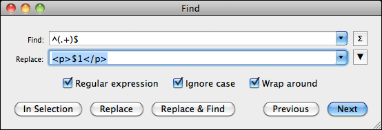
We will use this fact to our advantage and wrap every single line
with a paragraph tag. This can be easily done using a regular expression
search and replace. Regular expressions are extremely cryptic and I do
not expect you to understand how they work, so just follow the next few
instructions, if you may.
Open the search and replace window in your editor and make sure Regular Expressions are enabled. Occasionally you may find a checkbox in the search window, so give it a quick look. Now enter ^(.+)$ as the search term. Then enter
$1
in the replacement line. Run the search and replace across the entire
text and take a look at your results. Every line of text should now be
wrapped neatly by an opening
tag. If they are not, your editor might use a slightly different syntax. Undo whatever the editor just did and enter \1 in the replacement line instead of the previously used enter $1
replacement term. Run the replacement and check the results. If it is
still not correct, your editor might not support regular expressions.
In theory you could do these replacements in your word processor
also, though quite honestly, I don’t really trust them that well, and
personally prefer the use of a programming editor instead, which is also
significantly faster.
Dealing with special characters the right way
The next step for us to do is to replace all special characters with
their proper HTML entities. I’ve seen a lot of discussion about this,
and how it’s not working right or is platform dependent, but trust me,
when I say, that it is all bologna. There is a very safe way to handle
this in HTML that will properly display on every HTML device, regardless
of font or text encoding. The key to success lies in HTML’s named
entities.
If we take the ellipses (…), for example, in HTML there is a special
code that tells the device to draw that particular character. It is
called … With this entity, the device knows to draw an ellipse that cannot be broken into parts and is treated as a single character.
If you use the entity — the device will render a proper em dash. Proper length, proper size and all.
Next up are quotes. For that purpose, HTML offers “ and ” , entities that represent curly left and right double quotes, just the way we love them. Correspondingly, ‘ and ’ are the entities to draw curly single quotes.
And as easy as that, we have circumnavigated all compatibility issues for special characters. These named entities will always be rendered correctly, unlike the cryptic numeric entities that some people are using.
If you happen to see something like this in your HTML code – ¯ – you know you’re asking for trouble, so make sure to use named entities only!
There are, of course many more, including entities for currency
symbols, accented characters etc. and there are two basic ways to go
about having them all replaced.
The brute force approach would be to search and replace all of them
by hand, one entity at a time. This is not only time consuming but also
prone to error, as you could all too easily overlook some in your text —
but it may be the only option available to you.
The second — and easier way — is to automate the process. TextMate,
the programming editor I am using, has a function called “Convert
Selection to Entities excluding Tags” and it does exactly what we need.
With it, it takes me one mouse-click to have all special characters in
my entire book converted to named entities. Remember, using the right
tools for the job will always make your life easier!
Alternatively, there are a few websites on the Internet that allow
you to paste in your text and it will convert it for you, such as http://word2cleanhtml.com.
However, I take no responsibility for the quality of the conversion and
I want to point out that you are inserting your entire book into a
website you are not familiar with, where it could — theoretically — be
stored and re-distributed. I’m usually not paranoid but it is something I
thought I should point out.
If you have not been able to wrap all your italic text instances with
Once we are done with all that, we have a very basic HTML source file
for our eBook — one that is guaranteed without strange formatting
errors and things that plague countless eBooks. Make sure you save this
file somewhere, using an .html file extension. This will later
allow us to quickly evaluate and check the eBook file in an ordinary web
browser. In fact, if you double-click the file, you should already be
able to take a look at it in your browser. Paragraphs should be nicely
separated and italic text should show as such.
As you can see we’re quickly getting there now, but, of course, we
are not done yet. In the next installment we will begin to fine-tune the
various elements of the book and give it the polish it deserves. As you can probably tell by now from the last installment, we are by now
getting pretty close to real tangible results that you can actually
use, so let’s press on without delay.
The first thing we are going to do next is to turn our previously
marked up document and turn it into a valid HTML file. In order to do
that, we will have to wrap our text with proper header information.
Simply use the sample below and paste the next few lines into the
beginning of your existing text file.
Once you have done that, copy the following line and insert it at the very end of your text file.
We have now wrapped your entire marked-up book text with proper HTML
headers and have a valid XHTML file. Make sure to save it with an .html
extension, and then load the file in your web browser. You can now
already see a preliminary version of your book. You might want to resize
the browser window to roughly resemble the size of an eBook reader and
you will better see how the text flows on a smaller display. Exciting,
isn’t it?
You may have noticed that we have the first style sheet information
in our file now. It is very basic and determines only the look of the
tags.
p

{

  text-indent: 1.5em;

  margin-bottom: 0.2em;

}
Let us play with this paragraph style for a moment so you get a feel for what it does and how you can affect its results.
For example, change the text-indent value to 5em, save the file and then hit the Reload
button in your browser. You should now see that the first-line
indentation in your book has changed quite a bit — excessively so, I
should say.
Change it back to its original value and let us adjust the
margin-bottom value to 4em. Save the file and refresh it in your
browser.
As you will see, we have now dramatically increased the spacing
between individual paragraphs. We are on a roll. Are you feeling
dangerous, yet? If so, let’s do something radical!
Change the margin value back to its original value and include the following line right underneath it.
font-weight: bold;
I am sure you know what is going to happen once we save this file and
refresh it in the browser. As expected, all of your text is now in bold
typeface. Pretty cool, but let’s take it up another notch. Insert the
following line underneath the font-weight line.
font-size: 2em;
If you view this version in your browser, you now see that your book
is in a really large, bold print. Very cool, isn’t it? Especially, since
this is just how our chapter headings should look like… All we would
need is a way to tell the browser, which those chapter headings are.
Which gives me an idea.
Replace the paragraph style in your file with the following block.
p

{

  text-indent: 1.5em;

  margin-bottom: 0.2em;

}
p.chapter

{

  text-indent: 1.5em;

  font-weight: bold;

  font-size: 2em;

}
If you remember how style sheets work, you already see what is
happening. We have created a second paragraph style named “chapter” and
we will be using that one to style our chapter headings.
Here is a short sample text I will be using in the following examples
to show you how to massage the different parts of your eBook. It’s a
little piece from my book Terrorlord
from the “Jason Dark: Ghost Hunter” series, in case you’re curious. As
you can see, the example has chapter headings and I have wrapped them
with a parametrized paragraph tag. As a result the browser will use the
chapter style to render the text between these paragraphs, while using
the standard paragraph style for the other text blocks.
CHAPTER 1
    Jason Dark was leaning over the chess board when Siu Lin
entered the room with a dog-eared book in her hands.


    “Trying to solve another one of the London Illustrated’s chess challenges?” she asked.


CHAPTER 2


    She had a smug smile on her face when she finally looked at
 Dark, but it disappeared the moment she saw his expression.


    Dark had gone entirely pale as all blood seemed to have
drained from his face. For a moment his eyes stared straight ahead,
unfocused, not seeing anything. His lips were trembling and he clutched
his left arm.


    ***
This may all look a little garbled right now, because of the blog
layout, but feel free to copy this and save it to use it as your sandbox
playground, if you wish. If you load it up in the browser, this thing
starts to look like a book, actually, doesn’t it? And it will only get
better from here.
When we start a new chapter in our book, we usually want it to start
on a new page, and styles can help us do that. Insert the following line
in the chapter paragraph style.
page-break-before: always;
Unfortunately, web browsers do not handle page breaks properly —
traditionally, there are no page breaks in web pages — so you won’t see
them when you preview your book right now. If we were to load it onto an
eBook reader, though, it would work. Right now you will just have to
take my word for it.
Page breaks are nice and all, but usually, we would not want the
chapter heading to be right at the top of the page. It should be moved
down a little, leaving some white space around it, at the top and at the
bottom. Very easy exercise, really. All you have to do is insert the
following to lines in the “chapter” style.
margin-top:5em;

margin-bottom:2em;
Save it and refresh your browser, and you will see that you now have
nice, clean spacing around the “CHAPTER 1” and “CHAPTER 2” headings in
our example. And all of that without really changing your actual book
text itself.
We’re doing it all through styles, which means if you think the white
space is a bit too much, all you have to do is change the style values
and it will automatically affect all your chapter headings throughout
the entire book.
Now, you may have noticed the three stars at the end of my eBook
source file. I will use these for another specialized styling, because I
want these three stars to be centered on the page, something you will
encounter in most books at one point or another. Someone versed in HTML
would probably go about and simply wrap these stars with
and tags. Sadly, that’s a bad idea when it comes to eBooks.
Centering text in eBooks is one of the most error prone undertakings
because device manufacturers seem to have different takes on what
“centering” means. Sounds ridiculous, I know, but I am not lying to you.
To create foolproof centering we have to double-stitch our approach,
to make sure every device understands exactly what it is we’re trying to
do.
First we will include the following two styles in our file.
p.centered

{

  text-indent: 0em;

  text-align: center;

}

span.centered

{

  text-indent: 0em;

  text-align: center;

}
Since both declarations look identical, this might seem redundant, but sadly, some devices, like the iPad, require the
tag. I think it is also important to point out that the text-indent: 0em;
setting is important in this context. Without it, the device would
actually render our text slightly off-center because it would center the
text and then add a 1.5em indentation to it. Not what we want, so we
have to reset the indentation to zero.
To center our text line, we will now wrap it with the proper HTML tags and make it look like this.
***
This may not look nice in code form, but it solves all our problems
and the line will now be centered correctly on all devices I have come
across. I am enclosing here a little preview, roughly what the example
looks like with all our little improvements in place.
CHAPTER 1
Jason Dark was leaning over the chess board when Siu Lin entered the room with a dog-eared book in her hands.
“Trying to solve another one of the London Illustrated’s chess challenges?” she asked.
CHAPTER 2
She had a smug smile on her face when she finally looked at Dark, but it disappeared the moment she saw his expression.
Dark had gone entirely pale as all blood seemed to
have drained from his face. For a moment his eyes stared straight ahead,
unfocused, not seeing anything. His lips were trembling and he clutched
his left arm.
***
In all of this, you may have noticed that I did not set any default
font face, size or text justification. This is not an oversight, let me
tell you. I did that on purpose.
eBook readers allow users to use their preferred settings. Font size,
justification and font type are very personal things and who are we to
mess with what people like? By not setting our own values, the eBook
device will automatically fall back onto the user preferences and
immediately display our book in the user’s preferred way. It may be a
small thing, but trust me, it goes over really well with your readers.
Usability is key!
Go ahead now, and make the proper adjustments to your own book file.
Mark up your chapter headings and the centered text portions, adjust the
styles to your linking and take a look at your own book. As you may
have noticed, it has already turned into a pretty reliable and
predictable thing. Let me stress again at this point, that this is the
reason why you do not want to export your eBooks straight from a word
processor. See, how much control you have over the look and feel of your
book with just a few simple steps? And it only gets better…
In the next installment we will add still some more frills to our
book and then in the not too distant future, go to the next step,
building the actual eBook in Calibre.Last time I promised you I’d cover some more frills for your eBook
formatting, and as you’d certainly agree, images are a big part of that.
Even for fiction writers images offer great opportunities to present
your book in the best possible light, so let’s take a look today how you
ca best make use of that.
In fiction, one of the most obvious places to have images included is as part of a book’s chapter heading.
Imagine, if you may, to include a small visual vignette underneath the chapter heading text to set it apart even more.
Here is a small image that I am going to use in my examples. Feel
free to right-click the image and save it for your own perusal.
 In theory, this is exceedingly easy to do, using style sheets and the
background-image parameter. You could simply add the following line to
your style for chapter headings and see the image appear and trickle
down through all your chapter headings.
In theory, this is exceedingly easy to do, using style sheets and the
background-image parameter. You could simply add the following line to
your style for chapter headings and see the image appear and trickle
down through all your chapter headings.
background-image: vignette.png
Unfortunately, the background-image parameter is not really part of
the CSS style sheet subset used by the ePub eBook file format. Although
most eBook readers support it at this point — the major exception being
the Kobo reader — it is sadly not safe to use. This may change in the
future, but if you want to create a stable eBook I discourage its use.
The alternative is, sadly, not nearly as elegant and requires a good
bit more work. What we have to do is include the image manually at every
chapter heading, which might look something like this.

The important part when using images is to include the slash at the end of the ![]()
alt parameter. Without them, our final eBook will not be in the proper format required by many distribution channels. The alt
parameter is really just a text description of what the image shows. It
is used if, for some reason, the device can’t read the image or if it
is displayed in a mode for blind people, where images are dropped
altogether. Instead, the alt-text is used to inform the reader what the
image showed, which is why I used the word “pinstripe,” since the little
graphic I embedded there is an image of a pinstripe. Makes sense,
doesn’t it?
To center our vignette on the line, all we need to do is wrap the image tag with the proper
and
CHAPTER 1
Jason Dark was leaning over the chess board when Siu Lin entered the room with a dog-eared book in her hands.
“Trying to solve another one of the London Illustrated’s chess challenges?” she asked.
CHAPTER 2
She had a smug smile on her face when she finally looked at Dark, but it disappeared the moment she saw his expression.
Dark had gone entirely pale as all blood seemed to
have drained from his face. For a moment his eyes stared straight ahead,
unfocused, not seeing anything. His lips were trembling and he clutched
his left arm.
***
Even though you have to manually include the image tag in every
instance of your chapter heading, oftentimes you can automate the
process by using your programming editor’s search/replace function using
a very simple regular expression.
Simply replace — for example —
(.+)
with
$1
While it would be theoretically possible to create a separate style
for these images that contains instructions to center the image, I
decided against it. We have found a way that is virtually bullet-proof
by using the
and
In his book “Scourge,”
author David H. Burton took this one step further when he wanted to
have his chapter headings in a fancy font that mirrored the typeface
used in the book’s cover. Since fonts are extremely limited on eBook
readers, we decided to achieve this by using images of the actual text
that were created in Photoshop. While it increased the file size
somewhat, it did have the benefit that it immediately created a very
distinctive look and feel for the book as a whole and paid big dividends
in my opinion.
 This is how it was created.
There is a big catch to this, however, as we are no longer able to
let Calibre automatically create a table of contents for you. The
problem here is that we no longer have the plain text that Calibre
relies on to build the TOC with. All we have is an image that Calibre
can’t interpret. So, what do we do?
There is a nifty work-around for this. Let’s simply change our code to something that looks like this.
Chapter 1
How cool is that? What we did was, we created a traditional chapter heading with plain text, but by using display:none
as an additional style setting, we essentially make the text invisible.
It is there in the code for Calibre to use, but the eBook device itself
will not render it. Right underneath then, we plant our graphic text
and all is as it should be.
I hope you enjoyed our “frills” session so far, but we’re not quite done yet.
Aside from chapter headings, there are occasions where we would like
to include images directly in the text. Scene changes often are examples
of that, where traditionally small vignettes find their use.
If you want to do that, all we need to include in our text is a
proper image tag at the correct location, that could look something like
this.
Occasionally, you might want to embed images in the text itself for
illustrative purposes. We might want the text to flow around them, and
would like the image to appear either on the left or the right side of
the screen. Once again, all of that is a simple case for our styles.
img.left

{

  float: left;

  margin-right: 5px;

}
img.right

{

  float: right;

  margin-left: 5px;

}
To create an image that sits neatly on the left side of the screen
and has text flowing around it, we would simply use the following tag in
our mark-up.

We would use
respectively for an image that sits on the right side of the screen and has text flowing around it.
CHAPTER 2

Siu
Lin walked over to the small table and pondered over the chess pieces
for a moment. She tilted her head slightly to the side as she analyzed
the board set-up and ran through a variety of moves in her head. After a
few moments she sat down in a chair opposite of Dark’s, mulling the
chess problem over in her head some more. In silence both tried to
figure out the solution to the challenge, each trying to beat the other
to it. “Bishop to C6,” she finally said. “Then counter with the Rook to
H8, and from there it is going to be easy.”
She had a smug smile on her face when she finally looked at Dark, but it disappeared the moment she saw his expression.
Dark had gone entirely pale as all blood seemed to
have drained from his face. For a moment his eyes stared straight ahead,
unfocused, not seeing anything. His lips were trembling and he clutched
his left arm.
***
I will leave it up to your own imagination to come up with great ideas to use this cool feature.
Note: Unfortunately the mobi file format does not
allow for floating images at this time. This means, of course, that it
is not possible to use one of layout’s greatest features on the Kindle
to the best of my knowledge. If you have found a way to float text
around images in mobi files I would love to hear from you!
Here we are, already at the end of an installment, and we still have
not managed to get our book into Calibre to build a “real eBook. I
apologize for that and promise we will definitely do that in the next
installment. In the meanwhile, at least you can check out your book in a
web browser and play around with the many features we have explored so
far.
Everyone has different needs for their books, so if you have any
specific ideas for “frills” that you’d like me to discuss, please feel
free to leave me some comments.Okay, it is time for me to finally make good on my promise and turn your
book’s HTML source file into a proper eBook. All we need is a little
software called Calibre that you can download here.
I want to take a brief moment to point out that Calibre is a free
software package and I cannot thank its developer Kovid Goyal enough for
putting so much time and effort into this program. Not only is he
putting all the effort into writing the application and improving it
constantly, Kovid is also very active in his support forums and tries to
help everyone with problems whenever he can. So, please feel free to
support his restless efforts by perhaps donating a few dollars for the
cause. You will find a button on his website and maybe you’d even be
willing to commit a small amount every time you actually prepare a new
book for publication using his software.
All right, now it’s time to get serious. One of the great things
about Calibre is that it allows us to build a variety of eBook formats
from the one source file we have so carefully crafted.
 The
first thing we need to do is to add our new book to the Library. Simply
click on the “Add books” button in the upper left corner and select
your book’s HTML file. A lot of people do not know that you can actually
use an HTML file as a book source in Calibre, but as I pointed out, not
only is it possible, it is, in fact, the most reliable way to create a
predictable output.
The
first thing we need to do is to add our new book to the Library. Simply
click on the “Add books” button in the upper left corner and select
your book’s HTML file. A lot of people do not know that you can actually
use an HTML file as a book source in Calibre, but as I pointed out, not
only is it possible, it is, in fact, the most reliable way to create a
predictable output.
Once you have done that you will see the book appear in the top line
of the Library listing. It may have a strange name at this point –
Calibre uses the HTML file name by default – but we will fix that in a
second.
The next step is to edit all of our book’s meta data. Highlight your
book in the Library listing and then click on the “Edit metadata” button
in the toolbar at the top. You will now see an input form that allows
you to insert all the relevant information about your book on the left
side. Most of these fields should be self explanatory, though the
“Author Sort” line might be confusing. It is used to allow you to use
your last name for sorting. So, instead of “Guido Henkel” I would enter
“Henkel, Guido” here.
The large “Comments” field at the bottom is used for your product
description. Simply enter your whole flap copy here, your synopsis or
whatever you want to call your product description.
Moving on to the right side of the input window you will see a block
that is called “Available formats.” Currently it includes only a ZIP
file, which is a zipped-up version of our HTML source. Do not do
anything else in this block. We will get to it at a later stage.
Finally, lets include the cover of the book into the meta data. This
is the cover that will be included in the front of your eBook. It is not the cover that is used by distribution channels to list your book! It is the actual cover image inside the final eBook.
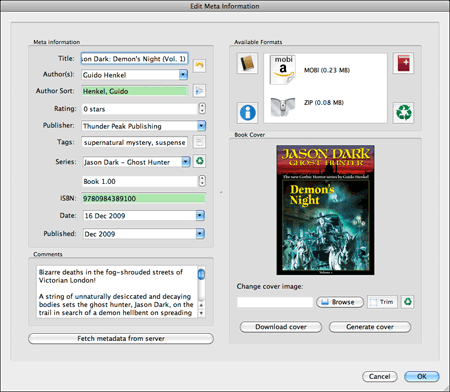 I always create 600×800 pixel color versions of the cover for use
here. Even though many eBook readers do not support color at this point
this is nothing you have to worry about. The device will automatically
convert this to a grayscale image for you. Purists may say at this point
that you should actually create an optimized grayscale image for
inclusion for better quality. For the most part I found this not
necessary. While the end result might be a tad better – and I stress might
here because eBook readers are still notoriously bad at displaying
images in general – and while the file size might be reduced, I found
the tradeoffs not worth it. Not only would you have to create separate
versions for color and grayscale readers, but with the growing
proliferation of color devices, you will make it possible for Kindle
readers on the iPad, for example, to enjoy the full color version of
your cover. That alone should be reason enough to stick with the color
cover.
I always create 600×800 pixel color versions of the cover for use
here. Even though many eBook readers do not support color at this point
this is nothing you have to worry about. The device will automatically
convert this to a grayscale image for you. Purists may say at this point
that you should actually create an optimized grayscale image for
inclusion for better quality. For the most part I found this not
necessary. While the end result might be a tad better – and I stress might
here because eBook readers are still notoriously bad at displaying
images in general – and while the file size might be reduced, I found
the tradeoffs not worth it. Not only would you have to create separate
versions for color and grayscale readers, but with the growing
proliferation of color devices, you will make it possible for Kindle
readers on the iPad, for example, to enjoy the full color version of
your cover. That alone should be reason enough to stick with the color
cover.
Select “Browse,” find your cover and make sure it displays properly
in the meta data window. We now have all our meta data and it is time to
click “OK” to make sure they are saved.
 Next,
click on the “Convert books” button in the toolbar at the top of the
screen. This is where the rubber meets the road – from a technical
standpoint. Here you find the modules that actually turn our source HTML
file into the various eBook formats. While all the menu entries and
names might seem extremely technical to you, I will guide you through
here to make things easier to understand, especially since most of the
technical parameters are identical regardless of the selected output
format. Which reminds me… let’s select an output format.
Next,
click on the “Convert books” button in the toolbar at the top of the
screen. This is where the rubber meets the road – from a technical
standpoint. Here you find the modules that actually turn our source HTML
file into the various eBook formats. While all the menu entries and
names might seem extremely technical to you, I will guide you through
here to make things easier to understand, especially since most of the
technical parameters are identical regardless of the selected output
format. Which reminds me… let’s select an output format.
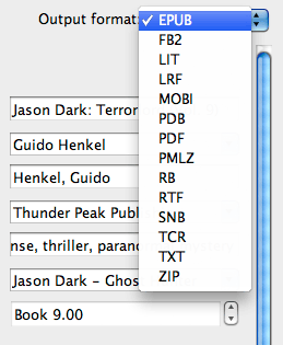
In the upper right hand corner you will find a drop-down menu allowing
you to select the output format you want to build. For our purposes
right now, select EPUB, which we will be able to use for the Nook, the
Apple store, Kobo, Google Books and other outlets.
On the left side of the input window you will see a column of icons.
these icons give us access to the different settings for the ePub
compiler. Most of these parameters we will leave untouched as the
default settings that Calibre provides are real world common sense
settings. In fact, we could already press the “OK” button at the bottom
of the window and get a decent eBook out of it.
Perfectionists that we are, however, we want to take things a little bit further.
Click on the “Structure Detection” icon and you will see a series of cryptic-looking XPath instructions. Not to worry…
Calibre uses this section to determine your book’s structure so that
it can format it properly. For example, this can be used to create page
breaks before a new chapter. In fact, it is the default setting. The
reason I am taking you here is because in case you do not want to
include page breaks here, you will need to switch it off by selecting
“None” from the “Chapter mark” drop-down menu.
Next stop, our table of contents (TOC). Select the “Table of
Contents” icon so we can tell Calibre how to automatically build a fully
linkable TOC and include it in our eBook.
Since we have been using a special stye in our HTML file to manicure
chapter headings, we can now use this style to tell Calibre where each
chapter starts.
All we have to do is enter
//h:p[re:test(@class, "chapter", "i")]
in the field for the “Level 1 TOC (XPath Expression)”. It tells
Calibre to look for all instances where the style “chapter” is applied
and add them to the table of contents. Calibre will automatically use
the entire chapter heading text to display in the TOC, which means the
entire block of text that is style with the “chapter” style. From my
experience that is exactly what we want. If not, you could narrow the
selection down further using XPath expressions to drill down further. If
you want to learn more about XPath expressions, feel free to check here.
The last step before we build our book is found in the “EPUB Output”
section. Select the icon in the left toolbar and you will find a
checkbox entry that says “Preserve cover aspect ratio.” Make sure to
select this as otherwise your cover will be disproportionally scaled to
fill the entire display of any eBook reader. I am not sure why this is
not checked by default, but so be it.
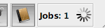
That’s it. Click on the “OK” button and you will notice that Calibre
is doing some work in the background. It will tell you so with a small
animation in the lower right hand corner of the Calibre window.
 This will take a second or two, depending on your computer’s speed and
the length of your book. But once it is done we are ready to save the
finished eBook.
This will take a second or two, depending on your computer’s speed and
the length of your book. But once it is done we are ready to save the
finished eBook.
 Click on the “Save to disk” icon in the top toolbar and select a location where you want the book to be saved.
Now it is time to take a look how things turned out – it is the big
moment. While it is possible in to use Calibre’s viewer, I found that
despite the overall quality of Calibre, the viewer is – at the time of
this writing – not at all representative for what your eBook really
looks and behaves like on a real reader.
For first checks I always use the software versions of the Kindle or
the Nook reader or Adobe Digital Editions. These will immediately give
you the results you’re looking for, especially since many people use
these application to actually read their books on. However, you should
always make sure to also load you books onto the actual devices, if
possible, to see they behave properly. It is always better to make sure
than to make assumptions and extrapolate from a software implementation
running on a desktop computer.
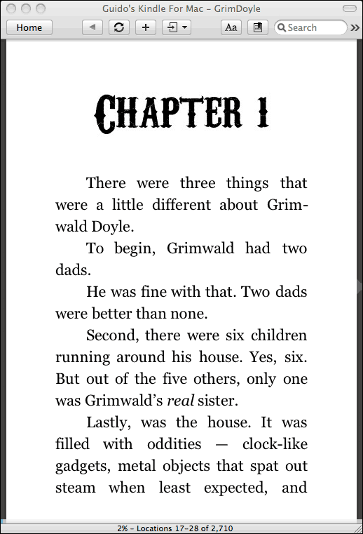
When I load an eBook up for the first time, there are usually three things I checked first.
- Does the cover display correctly?
- Are there proper page breaks before chapters, and do the chapter headings display properly?
- Does the book contain a complete and working table of contents?
Once you have made sure these are in order, you should begin to
browse the book very carefully from beginning to end. Look particularly
for passages where text switches suddenly to italic text. Particularly
when have inserted the
If there are errors in your source file you will have to go back and
edit the HTML file. What is important is that once you have made the
changes, you will have to re-import the HTML file back into the Calibre
book. In order to do this, click on the “View metadata” button again to
bring up the meta data input form.
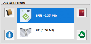
You will see that the box saying “Available formats” now also includes
an EPUB entry. Delete all the entries here, MOBI, EPUB and most
importantly the ZIP entry. Simply select them and hit the “Delete” key
on your keyboard to get rid of them.
All we have to do now is bring the HTML file back by clicking on the
icon with the red book and the plus sign in the right hand corner.
Select your corrected HTML file and then go ahead and rebuild your eBook
file. Save it and check to make sure the errors have gone.
Once you have confirmed that everything is as it should, it is time
to build the other formats. Select MOBI from the drop-down menu in the
“Covert books” form. chances are you will not have to change anything
else, as the structure and TOC settings format independent, and because
MOBI does not require any format specific adjustments. Build the eBook
and save it.
Congratulations, you now have proper EPUB and MOBI ebook versions of
your book that are virtually guaranteed to be free of the most common
formatting errors found in today’s eBooks. To distribute your eBooks,
all you need to do is send the .epub or .mobi
file to your customers via email, or to upload them to Amazon,
Barnes&Noble, or whichever outlet you want to serve. In case you
were wondering, the eBook files contain all the graphics and images that
are needed, so you will not have to send the JPG images with it. They
are safely embedded directly in the files so that they can’t get lost.
I hope I have been able to help you with this series to understand
that in order to create quality eBooks it is not only necessary to
tackle the problems by their roots, but also that it is not nearly as
intimidating a process as one might think.
Building an eBook from the manuscript to the final build can be done
well under an hour if you’re familiar with the workflow. In fact,
formatting my own “Jason Dark” titles, usually takes me no more than 15
minutes.
Let me know how this series has helped you, and let me also know
there are subjects and issues that you’d like discussed in more detail.
I’ll definitely see what I can do and highlight these issues in
follow-up posts to this series.
In addition, if you wish to hire me to create your eBooks for you, feel free to send me an email.
Lastly, if you enjoyed this series and found it helpful, please feel
free to support my efforts by purchasing one of my books. You can find
them here at Amazon, Barnes&Noble or on the official Jason Dark: Ghost Hunter website.


 Every
ebook reader supports different file format. Like Amazon Kindle
supports AZW,MOBI,PDF but does not support Epub. While Nook, Sony reader
does not support AZW format. If you want to read your books on
different devices without difficulty, you can use Epubsoft Ebook
Converter to rebuild the file formats. It can convert DRM protected
kindle books to EPUB format.
Every
ebook reader supports different file format. Like Amazon Kindle
supports AZW,MOBI,PDF but does not support Epub. While Nook, Sony reader
does not support AZW format. If you want to read your books on
different devices without difficulty, you can use Epubsoft Ebook
Converter to rebuild the file formats. It can convert DRM protected
kindle books to EPUB format.


